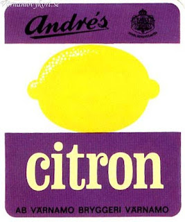
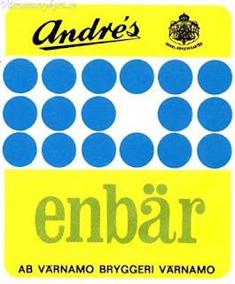
The interesting thing is, since the late 60s till today there haven't been drastic changes and it is almost impossible to recognize which one belongs to the 60s era and which one to 2000 something.
Monday, 25 January 2010
JAUNA GAITA
This is what I found the other day and it's amazing! It's Latvian mag named Jauna Gaita and they have just celebrated it's 53rd anniversary. Thumbs up for keeping the recognizable cool style for over half a century. One of the brilliant things is that you can see all or at least most of the mag covers on their site and observe slight changes in styles throughout the decades. Mid 50s seem quite boring with simple illustrations, late 50s become more typographic and the 60s is the time when the design explodes in its beauty. All those colours and shapes, fantastic!
The interesting thing is, since the late 60s till today there haven't been drastic changes and it is almost impossible to recognize which one belongs to the 60s era and which one to 2000 something.


The interesting thing is, since the late 60s till today there haven't been drastic changes and it is almost impossible to recognize which one belongs to the 60s era and which one to 2000 something.
I D.I.Y.FREE DOWNLOADS
I D.I.Y. is full of free typefaces, vintage labels, designs and also full of good visual references.


DON'T PRINT JUST ON PAPER
Whilst browsing through Inkjet Designs blog I discovered the company that prints your photos + graphics on bags, tea towels and more. It is called The Fabric Press. What a good way to put your design out there!
Also, there is a company that makes custom fabric out of designs called Spoonflower.
Here are a few things done by Inkjet Designs, really nice colours and simple shapes but it all looks really nice.


Also, there is a company that makes custom fabric out of designs called Spoonflower.
Here are a few things done by Inkjet Designs, really nice colours and simple shapes but it all looks really nice.


Thursday, 21 January 2010
RETRO SWEET SHOP
Just been doing some research and stumbled upon this retro beauty. Apparently it's somewhere in Covent Garden which surprises me as I've been there countless times and never seen it. This is one of the reasons why I just love London. It's always something new to discover and see and it can be hiding in a little street that you always pass but for some reason avoid. Anyways, I will be paying this place a visit, not because I like to eat sweets but because I like to look at them. There is something positive and relaxing about their shapes and colours and when you mix them up they just always look great.


I like it how they've done this promo video, all those scratches and marks on it, also the sound they make. Staying true to the old's cool!
Monday, 18 January 2010
TEA RESEARCH: PEYTON & BYRNE


Peyton & Byrne tea packaging by Farrow Design. Simple yet effective. We can see the use of colour coding for a particular flavour which is quite common when it comes to tea packaging.
It is also used a few more times on other Farrow Design projects.
Friday, 15 January 2010
TEA RESEARCH:MR SCRUFF
MAKI KAHORI
So lush!These amazing illustrations have been created by Japanese artist Maki Kahori. Check her website for more work here

Thursday, 7 January 2010
Tuesday, 5 January 2010
ANOTHER FIND: COMPTOIR LIBANAIS
Another accidental find. Style conscious Middle Eastern flavoured cafe called Comptoir Libanais. A galore of colours, patterns, flavours and a touch of retro feel.


Subscribe to:
Posts (Atom)